In architectural design, the ability to communicate your vision effectively is as crucial as the design itself.
Architecture presentation boards are essential for this type of communication. These boards provide a visual and textual representation of your architectural solutions that is easy for your clients to understand.
Want some ideas for creating more effective architecture presentation boards?
In this 7-minute read, we’ll delve into the art of crafting presentation boards that not only convey your design intent but do so in a manner that captivates and convinces your audience.
So whether you’re a seasoned architect or a new contractor working on your first project, the tips in this article will help elevate your presentation skills and land you more clients.
Let’s start with a quick look at the basics.
Key Takeaways
- An architectural presentation board is more than a collection of drawings. It’s a strategic tool designed to tell a compelling story and guide your client to a confident “yes”.
- The most successful presentations are built on deep client discovery. Understanding your client’s lifestyle, goals, and motivations is the key to a design that truly resonates.
- Visual hierarchy is critical for capturing and holding your audience’s attention. A clean layout with a high-quality rendering as the main focus will always outperform a cluttered board.
- Creating professional boards with all the elements, including photorealistic 3D renderings, is faster than ever with modern design software like Cedreo.
Why trust us? Here at Cedreo, we’ve got 20+ years of experience working with housing pros in the home design space. We know what it takes for home builders, contractors, and designers to create architectural presentation boards that land them more jobs!
See How You Can Create Complete Projects with Cedreo
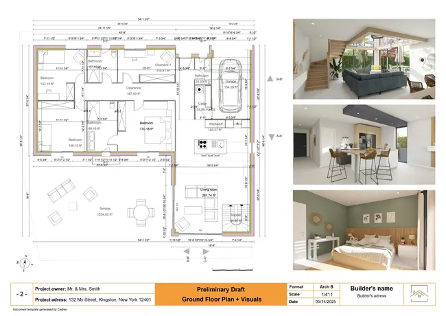
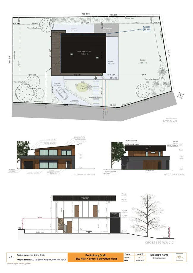
Plans – Get site plans, 2D floor plans, electrical plans, cross sections and elevation views — with all the technical details you need for a comprehensive project overview.
3D Visualizations – Use interior and exterior 3D renderings as well as 3D floor plans to help clients understand the finished project.
Documentation – Manage all your visual documents in one place, so it’s easier to present and sell your projects.
No credit card required, no commitment
What is an Architecture Presentation Board?
An architecture presentation board is a visual tool used by architects and designers to convey the concepts, details, and essence of their architectural projects. It combines images, drawings, text, and sometimes physical materials, to provide a coherent and appealing overview of a project.
These boards are pivotal in architectural competitions and client presentations since they serve as a bridge between the architect’s vision and the client’s understanding.
But presentation boards should be more than just a random collection of visuals.
- Use your board to tell a story and guide the viewer through the project’s inception, development, and final design.
- Effective boards balance aesthetics with information by employing a strategic layout to highlight key elements and facilitate easy comprehension.
- Presentation boards can vary in format from digital displays to large printed panels.
Check out the next section to see the 8 steps to creating your presentation board.
How to Present An Architectural Project
Learning how to present architectural concepts requires a blend of creativity, strategic planning, and technical skills. Here’s a step-by-step guide to crafting boards that showcase your project and impress potential clients.
1. Master the Client Discovery Process
Long before you think about the layout for your boards, the success of your architectural presentation is decided in the discovery phase. More projects get derailed by a poor understanding of the client than by any design flaw.
This isn’t just a casual chat about square footage, it’s a strategic investigation. Your job is to move beyond surface-level wants and understand the “why” behind every request.
Probe their lifestyle. Ask about daily routines. How do they use their current space on a Tuesday morning versus a Saturday afternoon? How do they entertain? The answers reveal the true functional needs of the household.
Identify the decision-maker. It’s crucial to know who has the final say on budget and major design choices early in the process. Make sure you address their specific concerns throughout the presentation.
Discuss long-term goals. Is this their “forever home” or a transitional space? This single detail impacts everything from material durability to planning for future accessibility needs.
The insights you gather here become the raw material for your entire design narrative. This process allows you to frame every design choice as a direct solution to their needs, so your presentation is as persuasive as possible.
2. Size & Orientation
The size and orientation of your presentation board are foundational decisions that set the stage for the rest of the board’s design.
Size: Consider the amount of content and the level of detail you want to present. Larger boards can accommodate more information and are suitable for complex projects but require careful organization to avoid overwhelming the viewer. Standard sizes often range from A3 for smaller projects to A0 for more detailed presentations.
Orientation: The choice between landscape and portrait orientation can influence the flow of your presentation. Landscape is popular for its width which facilitates a natural, left-to-right reading flow. It’s also nice for showcasing panoramic site views or extensive floor plans.
PRO TIP: Always tailor the size and orientation to the context of your presentation. For intimate settings, a smaller board might be more practical since it allows for closer viewing and discussion.
3. Layout Key Elements
The layout of your board is important for guiding the viewer’s eye through your presentation. This ensures they focus on key elements without missing important details.
Use a Grid System: The first step to a professional layout is aligning all your visual elements to an invisible grid. This practice brings a sense of order to the design, makes your board more readable, and ensures the layout feels intentional rather than haphazard.
Establish Balance and Flow: Think about the board’s visual weight to create a sense of stability. A symmetrical layout where elements are mirrored across an axis conveys formality and order, while an asymmetrical layout can feel more modern and dynamic.
PRO TIPS: Consider color blocks or frames to delineate different sections without cluttering the board with too many lines.
DON’T FORGET: Keep a consistent margin around the edge of the board. This ‘frame’ ensures that none of your content is lost if the board is mounted or encased.
4. Structure
The structure of your presentation board is about more than just where things are placed. It’s about creating a coherent flow that guides the viewer through your design.
Organizational Strategy: Start with a clear organizational structure, such as chronological, thematic or by the project phase. This helps in making your presentation logical and digestible.
Connectivity: Ensure there is a clear connection between different elements on your board. Use lines, arrows or even a numbered path to indicate the order in which the content should be viewed.
PRO TIP: Incorporate an “Introduction” and “Conclusion” section on your board. An introduction at the top left can set the stage for your presentation. Then, a conclusion at the bottom right summarizes the project outcomes or next steps.
DON’T FORGET: The viewer’s eye naturally moves from left to right and top to bottom. Place your most important information (like the project title or key visuals) where viewers will likely see it first.
5. Background
The background of your architecture presentation board plays a crucial role in setting the tone and making your content stand out.
Simplicity is Key: Opt for a simple, non-distracting background that enhances the readability of your content. A subtle gradient or a light texture can add depth without overpowering the visuals and text.
Contrast: Ensure there is enough contrast between the background and the content to make everything easily readable. Light backgrounds with dark text and visuals usually work best.
PRO TIP: Experiment with soft, architectural textures as backgrounds to add a thematic touch to your board without overwhelming the main content.
DON’T FORGET: Always preview your board in its final form before printing or presenting. What looks good on a computer screen may not translate well to a large format print or display.
6. Colors
Colors can evoke emotions, highlight important information, and organize your board visually.
Color Scheme: Choose a color scheme that complements your project. Use your project’s primary colors, or select a palette that reflects the project’s mood and context. Consistency in color usage across the board ties the presentation together.
Accent Colors: Use accent colors sparingly to draw attention to key areas or important details. This can be an effective way to guide the viewer’s eye through the board.
PRO TIPS: A limited color palette (2-3 main colors) can help in maintaining visual coherence and professionalism. Consider the psychological impact of colors. For example, blue can convey trust and stability, while green might be used to emphasize sustainability or environmental aspects.
7. Visual Hierarchy
While layout provides the structure, visual hierarchy is the art of guiding the viewer’s eye to the most important parts of your design first.
Your goal is to create a clear focal point, ensuring the client understands the main message of your board at a glance. After all, if everything is highlighted, then nothing is truly highlighted.
Prioritize Content: Decide what elements of your design are most important and deserve the prime real estate on your board. Typically, this includes your main concept image, and key plans or sections.
Size Matters: Larger images attract more attention. Use image and text sizes strategically to emphasize the most critical aspects of your project. Smaller images can show less important, but still relevant, information. The same goes for text.Color and Contrast: Use color strategically to draw the eye. A bright or contrasting accent color can make key visual elements pop against a more neutral background and signal their importance to the viewer.
8. Choose the Right Visuals
The images on your presentation board can make or break your project. Every visual must be high-resolution and purposeful, with a strategy that evolves as the project moves from concept to final design.
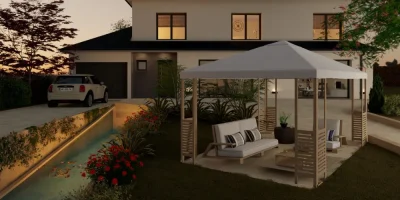
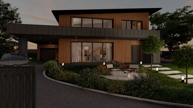
Vary Visuals by Stage: For early concepts, use simple illustrative sketches or “white mode” renderings to get buy-in on the core architectural form. For the final pitch, use photorealistic 3D renderings to sell a specific atmosphere and lifestyle.
Control the Mood with Lighting: Use lighting to set the mood. Warm light evokes coziness while cool light suggests modern sophistication. Showcasing different times of day can highlight materials (midday), create drama (sunset), or display the artificial lighting plan (night).
Ground Your Design in Reality: Use photomontage to integrate your 3D model into a photo of the actual project site. This powerful technique shows clients exactly how the new design will look within its real-world surroundings.
PRO TIP: If you plan to use 3D-generated images, make sure they are high-quality. Poor-quality, unrealistic images can detract from your design presentation. That’s why more and more housing professionals are switching to easy-to-use 3D design software like Cedreo. Cedreo makes it easy for anyone to generate photorealistic 3D project images for architecture presentation boards.
9. Text & Font
The text and font choices on your presentation board are vital for communicating your design intent clearly and effectively. Your typography should be clean, professional, and above all, easy to read.
Legibility is Crucial: Choose fonts that are easy to read at various sizes. Sans-serif fonts are often preferred for their clean lines and readability in both digital and print formats.
Create a Typographical Hierarchy: Use font size and weight to organize your written information. A clear distinction between titles, headings, and body text makes your points easy to scan and digest.
PRO TIP: Limit your presentation to two fonts to maintain visual coherence…one for headings and one for body text. This simplifies the design and enhances readability.
10. Deliver Your Presentation Professionally
How you deliver the final presentation documents is just as important as the content within them. Your method of delivery is a reflection of your process and professionalism, so it’s important to get it right. Here are a few tips.
Digital Delivery: The quickest method is to send a high-resolution PDF via email or a cloud link (like Google Drive or Dropbox). This is efficient and gives the client an easily accessible copy. Ensure your chosen font type is embedded and remains legible in a digital format.
Physical Prints: For a formal, in-person architectural presentation, a large-format printed board is unmatched. To make renderings of a modern design pop, consider using a high-contrast black background.
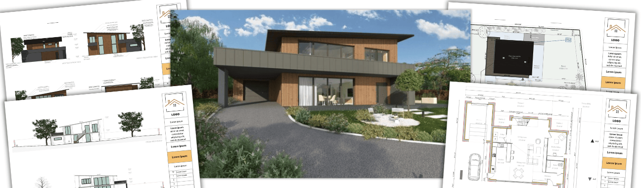
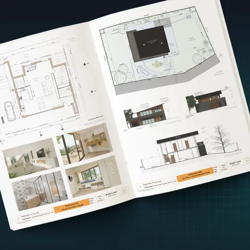
Use Separate Boards: Don’t try to cram all the information from a complex project onto one board. It’s better to use separate boards for different phases or ideas, like the site plan, floor plans, and 3D perspectives. This respects the visual hierarchy and prevents overload.
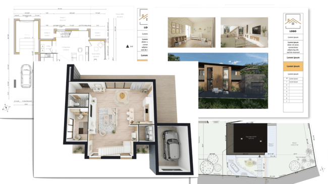
Types of Architecture Presentation Boards
Understanding the different architecture presentation board templates and layouts is essential for selecting the most effective way to communicate your project’s vision. Each type serves a unique purpose and audience, from conceptual designs to detailed technical drawings.
Here are a few architecture presentation board examples.
Conceptual Board
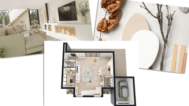
Conceptual boards are the storytellers of architectural design. They focus on the vision, ideas, and themes behind a project. They are less about detail and more about conveying the concept and atmosphere of the design.
- Use compelling visuals that evoke the intended feel of the project, such as mood boards, abstract diagrams, and 3D floor plans.
- Include brief text descriptions or quotes that capture the essence of your design philosophy and the main concept behind the project.
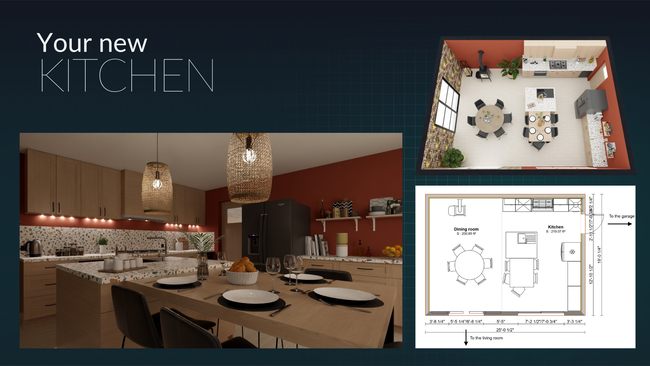
- Include a simplified electrical plan. Instead of just showing a specific drawing with symbols, explain its real-world function. For instance, present the 2D electrical plan alongside 3D renderings that show the actual effect of the proposed lighting.
Advice: Conceptual boards are your chance to connect emotionally with your audience, so choose images and words that resonate deeply with the project’s core idea. Remember: The goal is to intrigue and inspire while making viewers curious and excited about the potential of your design.se images and words that resonate deeply with the project’s core idea.Remember: The goal is to intrigue and inspire while making viewers curious and excited about the potential of your design.
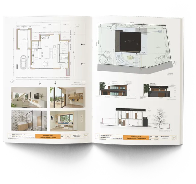
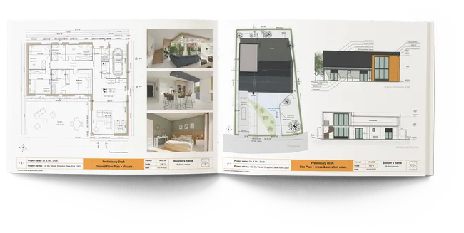
Technical Drawings Board
Technical drawing boards detail the specificities of the design through precise drawings and specifications.
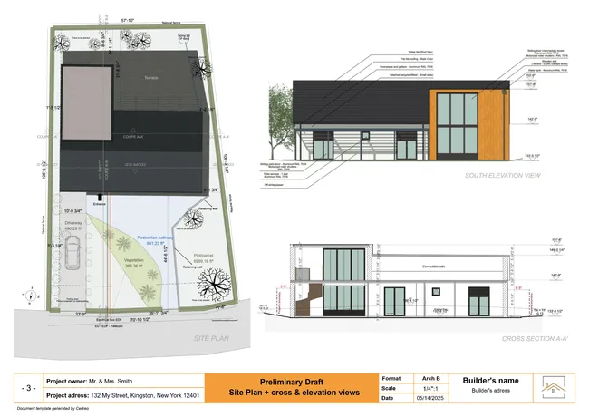
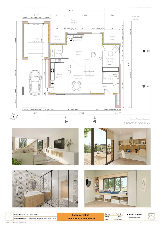
- Incorporate a range of technical drawings, including floor plans, elevations, sections, and detailed construction drawings, to provide a comprehensive overview of the project.
- Use annotations, dimensions, and notes to clarify the technical aspects and innovative solutions within your design.
- Include a simplified electrical plan. Instead of just showing a specific drawing with symbols, explain its real-world function. For instance, present the 2D electrical plan alongside 3D renderings that show the actual effect of the proposed lighting.
Advice: Make sure your technical boards are meticulously organized and labeled to ensure clarity and ease of understanding.
Remember: While technical accuracy is important, consider the layout and visual appeal of your board to ensure it remains engaging and not overly dense..
Professional Board
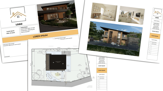
Professional boards are tailored for client presentations, competitions, or public exhibitions. They blend both conceptual and technical elements to present a complete story.
- Combine striking visuals, key technical drawings, and succinct, persuasive text to showcase your project’s strengths and feasibility.
- Balance the layout to highlight the most compelling aspects of your design while ensuring a logical flow that guides the viewer through the narrative.
Advice: Professional boards are your portfolio’s highlight reel. Focus on quality over quantity and make sure to select only the most impactful images and information that demonstrates your vision.
Remember: Take the time to get it right. A well-executed professional board is a powerful tool for winning bids, gaining approval, and impressing stakeholders.r winning bids, gaining approval, and impressing stakeholders.
8 Mistakes to Avoid in Your Architecture Presentation
Even the best design ideas can be undermined by a poor architecture presentation board. Even experienced architects make common mistakes that can derail their projects.
Here are 8 of the biggest mistakes you should avoid to showcase your design skills and build client trust.
- Content Overload: Don’t overwhelm the client with excessive details. A cluttered architecture presentation board buries the main idea and leaves viewers feeling confused.
- Poor Image Quality: Avoid blurry or pixelated images. Poor quality visuals signal a lack of professionalism and cheapen your design, which is especially damaging when presenting sleek, modern high tech designs.
- Inconsistent Branding: All of your architectural presentation boards should have a consistent visual style. Random fonts and colors make your work feel chaotic and unprepared.
- Unclear Messaging: Never assume your architecture speaks for itself. Your design ideas require a clear narrative to explain the “why” behind them and connect to the client’s goals.
- Technical Errors: Simple mistakes in plans or specifications can quickly erode a client’s trust in your competence. Always double-check your work.
- Sloppy Formatting: Pay attention to the small details. Misaligned text and inconsistent spacing create a messy appearance that distracts from your core message.
- Outdated Revisions: Always present the most current version of the plans.
Slow Turnaround: Don’t let too much time pass between iterations. Long delays kill project momentum and can make clients feel their feedback isn’t a priority.
Design Architectural Presentation Boards with Cedreo Today!
Crafting an architecture presentation board that effectively communicates your vision and details can be a daunting task.
Whether you’re creating a simple conceptual board for a small project or a detailed technical board for a custom home, Cedreo empowers you to make the best boards as fast as possible.
- Rapid Visualization: Cedreo lets you quickly transform your ideas into visual concepts, with easy-to-use features that save you loads of time and effort.
- One-Stop Solution: From initial sketches to final presentation boards, Cedreo offers a comprehensive platform for all your design needs.
- High-Quality Outputs: Produce professional, high-resolution 3D presentation board images that impress clients and showcase your projects in the best light.
- Project Presentations: Assemble your 2D plans and 3D renderings into a single, client-ready document within Cedreo. You can customize the presentation with your company logo, branding, and custom annotations to create a polished proposal that accelerates approvals.
Get started with Cedreo now (there’s a FREE version!) and take your architectural presentation boards to the next level.evel.
Architecture Presentation Board FAQs
Frame your architecture presentation board as a story, not a list of features. Begin with the core project goals you identified in discovery and walk the client through how your design solves their problems. Use a mix of visuals, from the big picture like site analysis down to the important details, to make your ideas tangible.
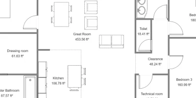
To make 2D architectural drawings easy to understand, always show furniture to scale. This helps the client get a feel for the room sizes and flow. The best approach is to supplement the 2D plan with 3D floor plans and renderings, which allow the client to visualize the space three-dimensionally.
A moodboard for architecture is about capturing a feeling. Combine high-quality images, color palettes, material textures, and keywords to create a cohesive visual theme. Think of it as a physical concept statement that helps you and your client agree on a project’s intended atmosphere before you get too deep into the design process.